4 ways to incorporate emotional marketing in multifamily

In the decades before the internet, print, radio, and television were the main players in the advertising game. While it remains important where you position your message, it’s equally important how your message is conveyed. The practice of using precise techniques to touch on a potential or current residents’ emotions have become an effective and widely used strategy in marketing.
From strategically chosen color schemes to font sizes, many components can ignite a range of feelings towards a brand and their message. While emotional advertising has become extremely popular for retail brands, certain tactics can be as effective for apartment communities to use to connect with residents. Here are a few ways brands relate to consumers and how they can be put in action with your apartment communities.
1. color psychology
Color and branding choices have a substantial impact on purchase decisions. While there are universal meanings for certain colors, an individual’s response to color is largely dependent on their own experiences. For example, yellow symbolizes “optimism and warmth,” while purple suggests “creative and wise.” Brands like McDonald’s and Yahoo use these colors in their logos to encourage customers to associate these feelings with their products.
Be sure the colors of your website and marketing materials portray your property accurately to current and potential residents. Choose a color palette that shows the personality of the community. Whether you’re going for bold, friendly, or peaceful, make sure your first impression makes a lasting impression.
2. imagery
Several studies suggest images are more likely to evoke emotional responses than others. Pictures of cute animals, inspirational moments, and fond memories of past times often strike positive responses from viewers.
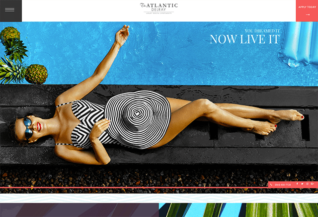
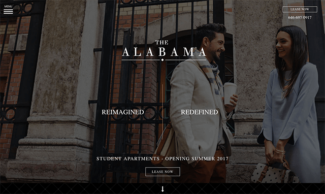
In apartment branding, imagery is used to strike emotional appeals in different rental markets. When choosing website visuals, it’s crucial to incorporate relatable imagery of the target market you want to attract. Below we provide recent examples of our work that offer imagery to evoke an emotional appeal.

Atlantic Delray, a new luxury development in Delray Beach, Florida. Located in an affluent Miami-metropolitan neighborhood, Atlantic Delray integrated lifestyle and community imagery to appeal to the discerning luxury market.

The Alabama is a renovated luxury student housing community located in the trendy Manhattan neighborhood of Greenwich Village. The Alabama caters toward refined students studying at Colleges and Universities in New York City. The imagery used on the website shows sophisticated, modern, and city living at its finest.
Whether you prefer to communicate with your residents via video or email, add in imagery that conveys the personality of your apartment communities. If you don’t have custom imagery budgeted, some great stock photo library resources are Stocksy and Twenty20. Both libraries take a boutique approach to stock photography by uses artist-generated content. Leaving you with authentic imagery options to appeal to varying target markets.
3. charitable cause
Taking a strong stance in support of a charitable cause has become a popular and positive trend among both newer and old businesses in recent years. From buying a pair of shoes to help the Tom’s “One for One For All” campaign to stacking Pura Vida bracelets in honor of both environmental and humanitarian causes, consumers are drawn to making a purchase that gives back.
Organize resident activities and events that contribute to the community around the apartments they call home. Partnering with local shelters, food banks, and volunteer programs are productive ways for current residents to be part of something greater than themselves while building an excellent reputation for the apartment community.
4. typography
Typography has the power to make or break a potential connection with residents. With websites acting as the “online face” of your community, it is crucial prospective residents can skim through your site and understand the type of residents who live there solely from imagery and typography used. Google Fonts offer a fantastic solution for many – they’re free for commercial purposes, easy to implement on your website, and can be downloaded and used for print materials.
While many large, household names are synonymous with a particular typeface, most brands have gone through several transformations before they found what worked for them and their market. Brands such as Coca-Cola, Microsoft, Walmart, McDonald’s, and Lego are among the many who tried different fonts and sizes throughout the years before deciding on the typeface they are known for today.

While it’s easy to want a unique font for your unique community, it’s best to stick to a legible font and let your individuality shine through with strong property imagery. Take a look at your current font selections and consider what impression it gives to your residents and prospective residents. If your community consists of sophisticated, luxury lofts, steer clear of comical or bubble letter fonts that convey the opposite. On newsletters and other handouts, avoid cursive or calligraphy, which is classified as whimsical and hard to read.
As a member of a property management team, it’s important to give equal attention to the property and the marketing materials. From page view to print, LeaseLabs is dedicated to delivering a cohesive digital strategy that equally represents your property and personality. Fill out the form below to learn more about how our services can help build a cohesive brand.
At LeaseLabs, we convert the broken, disjointed customer journey into a single unified strategy. Our products are your multichannel marketing solution with only one goal in mind: driving qualified traffic directly to your website so you can convert leads to leases at a much higher rate.
