web design spotlight: the darby
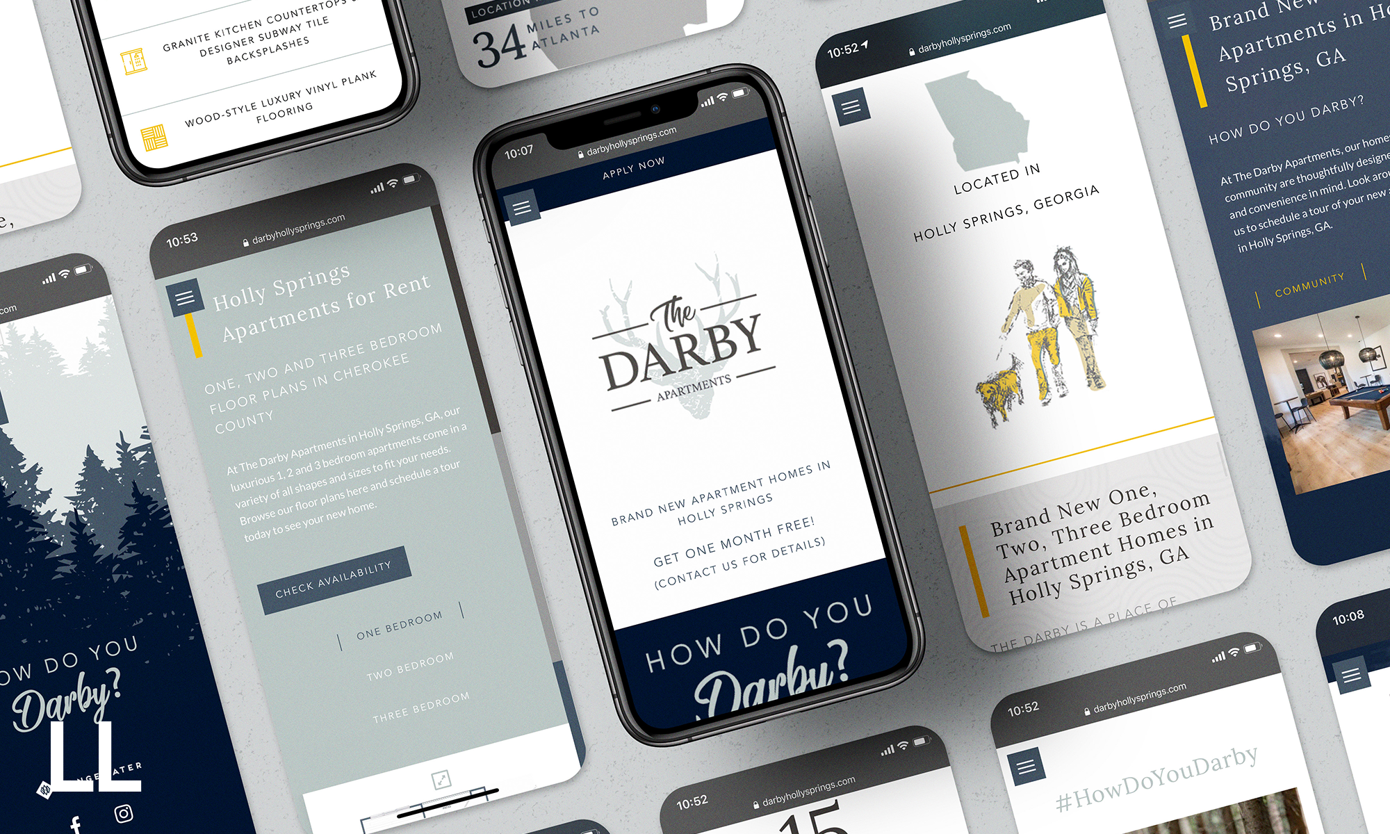
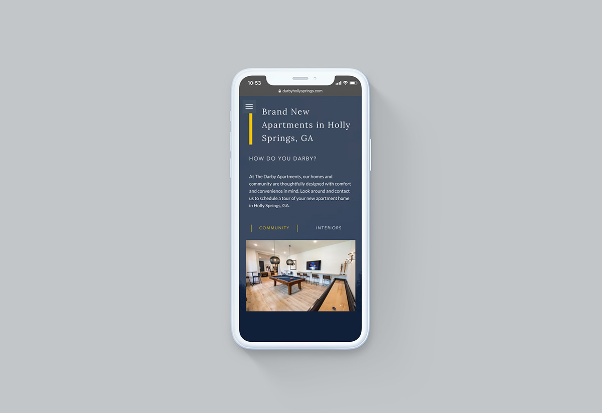
John Laue, the Interactive Design Director at LeaseLabs, has a knack for turning a feeling into a captivating website. For his latest project, The Darby, he did just that with unique subtle movement variations, punchy imagery reflective of the property’s lush surroundings, and an interactivity that makes prospective residents already feel at home. We met with John to discuss his process, inspiration, and how The Darby design ultimately came to be.
what inspired your approach to this design?
The Darby property is located in a suburban region outside of Atlanta, so we had an opportunity to highlight the surrounding environment that makes The Darby a special place to call home. I wanted to highlight the organic elements, so my inspiration came from the surrounding environments and landscapes.
in three words, how would you describe the aesthetic of this website?
Sleek, natural, subtle.
can you talk about some of the design features (including the subtle movement variation) and values they bring?
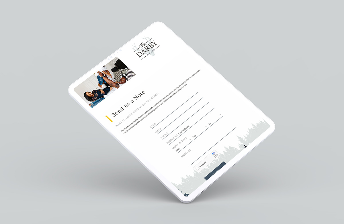
We had an opportunity to create something special in this pro website, so we created a unique style header functionality through the use of vector parallax behaviors, which offers a subtle and sleek animation based on the user’s scroll activity. This added distinct value by offering an interactive approach to the experience.
can you go into detail about the color scheme and the mood you wanted to achieve?
The color scheme and mood of the website was to showcase the organic nature of the surroundings without using the typical greens and brown colors. All patterns and embellishments are something you would find in nature, so we made sure to incorporate those elements carefully.
did you experience any challenges with this particular project?
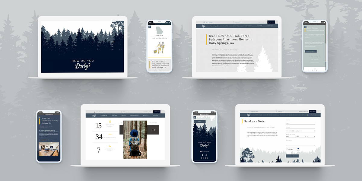
Some logistical challenges reared their heads in regards to the parallax vector header working correctly in different viewports screens, but we were able to solve that successfully.
what type of emotions were you aiming to evoke with this design?
I was aiming for the exploring adventurer — targeting those who crave nature thrills who may want to call The Darby home.
what are the key takeaways you wanted a prospect to walk away with after experiencing The Darby website?
Through careful design and execution, we were able to successfully deliver a bold and exciting digital experience that supports the vision and ultimately provides a key journey for prospectives to successfully convert into renting.
what was the most rewarding aspect of designing this website?
The most rewarding aspect of the design is assigning a creative function to a common scrolling behavior. As we visit websites every day, we also scroll every day, so implementing a behavior that supports the brand while simultaneously introducing a new way for people to interact with the supported vision is something that fulfills us as designers.
The Darby is a brand new apartment community in Holly Springs outside of Atlanta, Georgia. Featuring 1, 2, and 3 bedroom floor plans, The Darby offers exceptional features and unmatched amenities so that you can live the way you were meant to. Check out the unique digital experience here.
![]() Our Websites are creatively and digitally engineered to deliver. Interested?
Our Websites are creatively and digitally engineered to deliver. Interested?

