maxx properties corporate website rebuild

By the time MAXX Properties was due for a website refresh, they were closing in on 80 years of multifamily success. MAXX Properties is a family-run business dating back four generations. With a total of 35 communities spanning 7 states, the tight-knit company attributes their success to staying true to their motto, “Best Communities in the Neighborhood.”
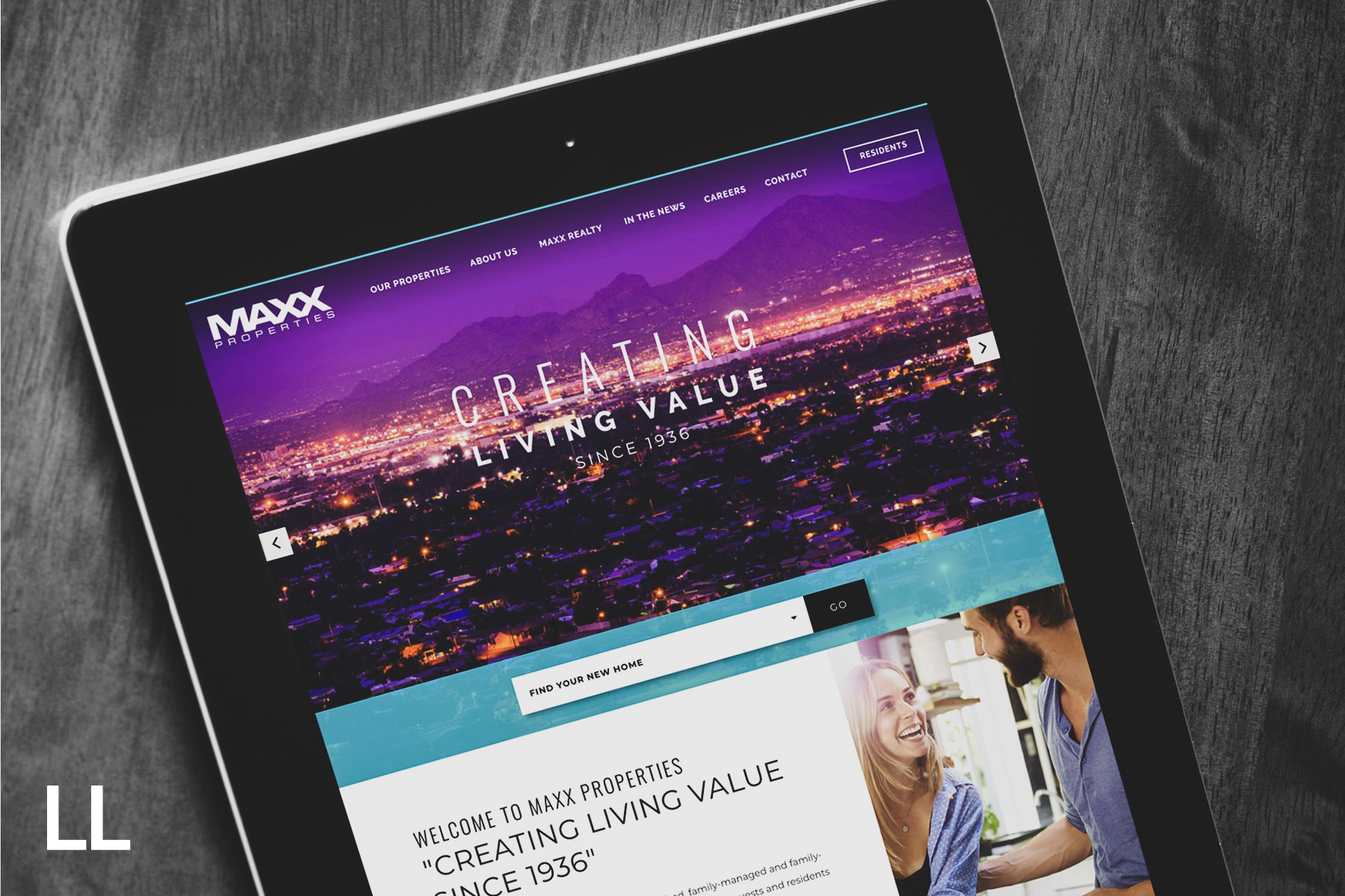
For their 80th anniversary, MAXX Properties wanted a fresh, new look for their website. Their website needed a responsive cross-device design, stronger calls-to-action, and a clean, sophisticated look to match their quality-of-service. A focal design goal was to modernize the look and feel while also creating an intuitive user experience. Creating an easy-use and aesthetically pleasing experience was a must.
disconnect
Understanding MAXX’s website visitor’s intentions was vital to a successful new design. Was the user’s goal to find a new apartment community? Discover new career opportunities with MAXX? Or perhaps learn more about the corporate history. To create a more intuitive experience, the design needed to address the various user paths available on the site.
A challenge with the MAXX Properties former website was the disconnect it created between the different demographics visiting the site and the page locations these users wished to locate. The homepage needed to universally appeal to young professionals looking to shorten commute time by living in the city, to empty nesters looking to downsize without sacrificing amenities, and to professionals of all skill-sets searching for a new job with the MAXX family.
design solution
A crucial design component incorporated into the MAXX corporate site was clear and intuitive headers that accurately depict the user’s journey. This alone created a seamless transition between the corporate homepage, careers page, about us page, and property websites.
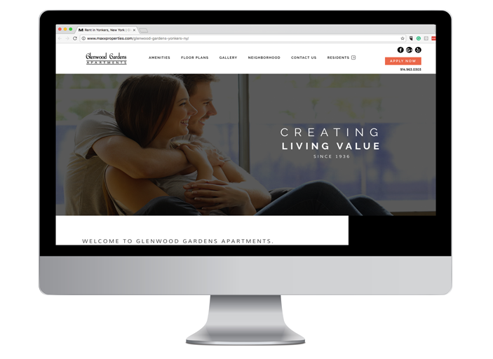
In order to cater to today’s multi-device consumer, our team utilized Scrolling Page Architecture™ (SPA) across the entire MAXX portfolio of property websites. SPA websites retrieve all the necessary code in a single page load and displays your entire website as one, long scrolling page that registers unique page views as your website visitors scroll down the site. The result? Digestible and easily accessible content across every screen size.

results
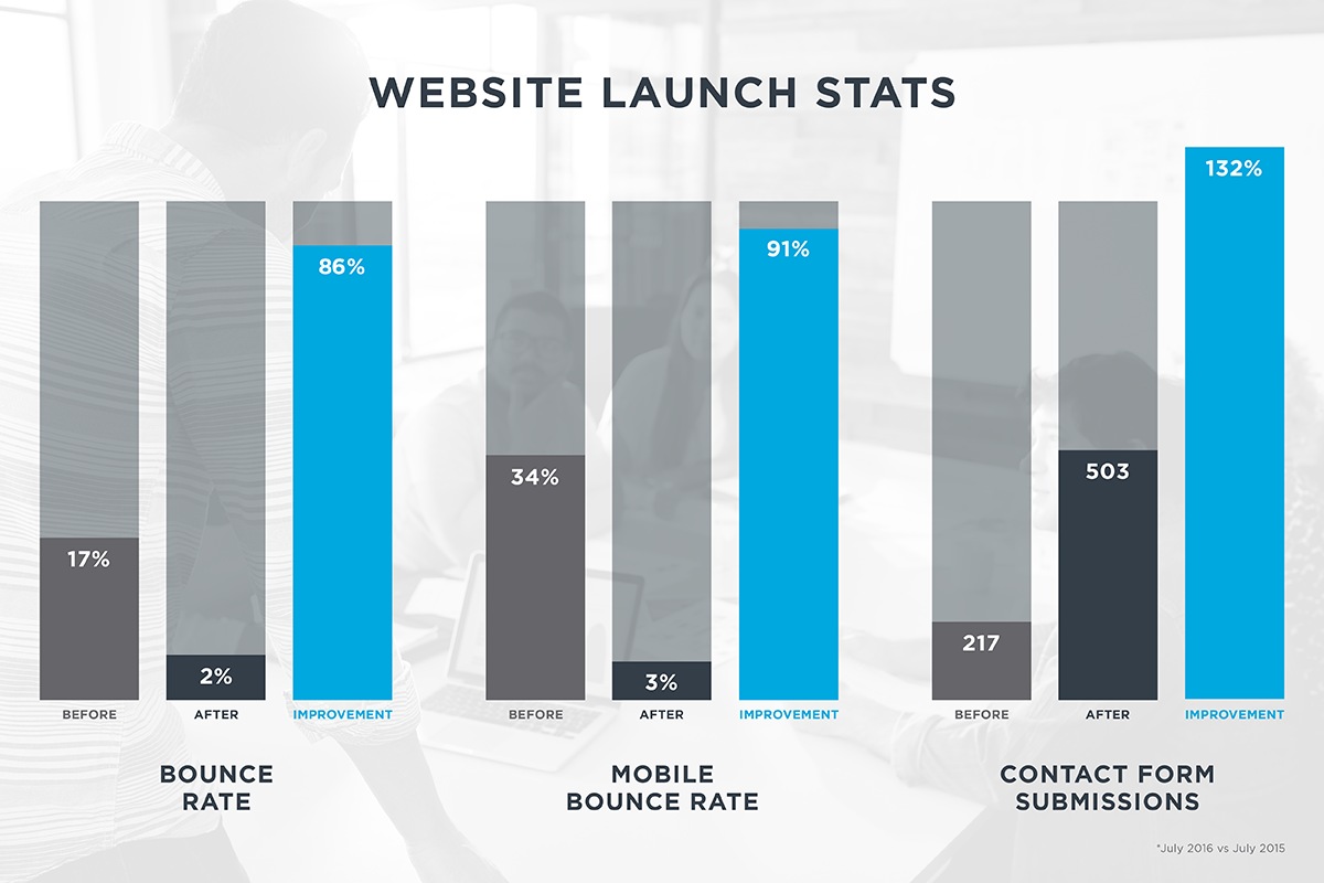
By allowing both mobile and desktop website visitors easy access to information, as well as a continuous scrolling experience to access interior pages, the user experience and website analytics improved significantly. After the first month the new MAXX corporate and property websites launched, bounce rate portfolio wide decreased from 17.83% to 2.36%, a significant 86.42% improvement from the same time period last year. More notable was the bounce rate on mobile devices that displayed a 2.98% bounce rate post-launch, an improvement of 91.19%! In addition to bounce rate improvements, contact form submissions portfolio wide increased by an impressive 132% during that same time period, a true testament to Scrolling Page Architecture™ website performance. Given these numbers alone, website visitors across the MAXX portfolio are more engaged and understand the user path.

“With innovative SPA design, our new websites are on the cutting edge of modern expectation, and user feedback has been outstanding. LeaseLabs is truly a step ahead”
-Virginia DeFeo, National Marketing Manager | MAXX Properties
