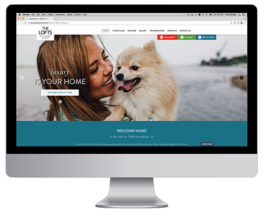
wasatch premier communities website refresh

Wasatch Premier Communities approached LeaseLabs in October 2015 for their third consecutive redesign of their corporate website and portfolio of property websites. As a longstanding client, our team knows isyourhome.com inside and out and ready for the challenge of creating a cutting edge site. After kickoff, both the LeaseLabs team and the Wasatch marketing team established the following goals for the website’s design and performance:
- The website should match current design framed as innovative and modern outside of multifamily.
- The design should showcase the caring, dedicated, and traditional side of Wasatch while exploring the pioneering and fun personality of the company as well.
- The website should easily facilitate prospects and residents throughout their entire customer lifecycle, from lead acquisition to lease signing.
inspiration
Our team needed influence from outside the industry, especially with a project that pushed design and programming outside of our normal corporate builds. Because Wasatch emphasized innovation, our team focused on user-centric designs. What better way to discover behavior patterns and current mobile trends than by analyzing mobile applications? The music application, Spotify, turned out to be a major influence during the design phase. The reasoning behind selecting this style and layout was the contemporary, user-friendly experience Spotify’s mobile app provided its users. At the end of the day, our team wanted to ensure isyourhome.com could withstand the test-of-time and stay ahead of the curve.
design strategy
With a tight timeline, our team was able to kickoff and launch the Wasatch corporate website and portfolio of 65 property websites within 5 months. The sheer size of this project should be noted, but what’s under the hood of these websites is even more impressive. Like a mobile app, isyourhome.com was wire-framed and designed with a true mobile-first experience. The fluid responsiveness allows the website to fit every screen size, and the individual property websites housed under the isyourhome.com domain were built using Scrolling Page Architecture™ web design. Scrolling Page Architecture™ websites, or SPA websites, retrieve all necessary code with a single page load, so the entire website is loaded on one long-scrolling page. This allows a user to scroll through your website without ever having to click and load interior pages. A huge differentiator between the isyourhome.com property websites and “one-page” websites is that these were all built with pagination. This allows Google, Bing, and other major search engines to register each individual page of the website as a unique page view in analytics as the user scrolls up and down the website. In other words, if a user scrolled down the entire property website, search engines will register this user as hitting the home page, floor plans page, features page, gallery page, neighborhood page, residents page, and contact us page in that single session. This is a major benefit for not only SEO, but for conversion optimization, and the overall user-experience.

Functionality and an optimal user-experience was key to achieving our goals. Minimalistic icons, full-screen video, and a clear property search bar greet the user once they land on the homepage. Regional landing pages were built to easily guide a prospective resident from the homepage to the interior property micro-sites. An advanced Google Maps integration was used so users can discover a Wasatch community from just about every local search query and can then adjust their search results by number of bedrooms, number of bathrooms, and rent price. Additionally, a “Favorites” feature also allows website visitors “like” properties and store them under the “Favorites” tab, solely utilizing their browser’s cache.
898% increase in contact form submissions
Three months after launch, we saw some impressive metrics comparing website performance analytics from three months post-launch compared to the same time last year (May to August 2016 vs. May to August 2015).
- 429% increase in pageviews
- 163% increase in pages/session
- 18% increase in average session duration
- 48% improvement in bounce rate
The most impactful metric improvement was contact form submissions. Between the three month period after the launch of the isyourhome.com portfolio compared to this same time period last year, Wasatch experienced an increase of 898% in contact form submissions portfolio wide. Isyourhome.com not only pushed the boundaries of multifamily corporate website design, it pushed performance.
