client
Southern Land Company
project
Vertis Green Hills
location
Nashville, TN
services
Branding, Website, Digital Marketing
Vertis Green Hills is a new mixed-use apartment community comprised of 310 units in the heart of Green Hills, one of Nashville’s most desirable neighborhoods due to is exclusivity, upscale shopping and dining options. This 18-story community features 67,000 square feet of offices and 20,000 square feet of restaurant and retail space. The community is highly desirable for its location in Green Hills just outside of Downtown Nashville and it’s close proximity to high-end shopping, entertainment and recreational opportunities as well as several major employers. Vertis is ideally suitable for professionals looking for a sophisticated, luxury community in the Green Hills area.
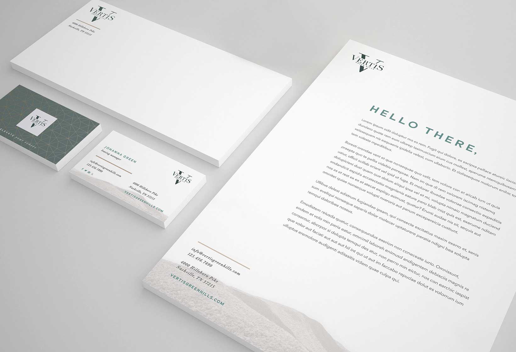
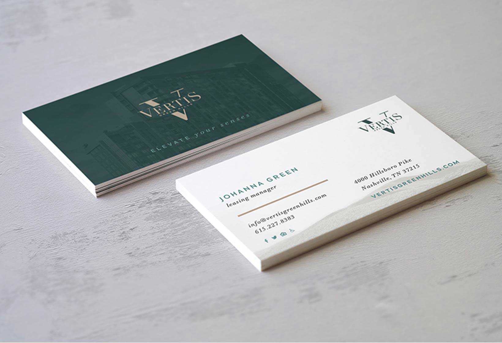
Southern Land Company desired to holistically brand/market its new development in the exclusive Green Hills neighborhood of Nashville, Tenn. It would be the only luxury high-rise community ever built in the area with resort-style amenities and unparalleled services. A key outcome was to create a 360° cohesive appearance. The messaging resonates with professionals in their 30s and 40s, and offers a solid connection with the interior palettes for authenticity.
Elevate Your Senses. Don’t just stir your senses, elevate them. At Vertis, you’ll live in an elegant luxury home with your head in the clouds—literally. Green Hills’ premiere new high-rise paradise awaits, with its unparalleled amenities, sweeping views and timeless design. Elevate your senses and your standard of living at Vertis.
The “Elevate Your Senses” concept is a direct play off the property’s sheer height and prominent view looking over Green Hills. The brand developed is modern and minimalist, providing a nice balance of design catering to those looking for an upscale living with “homey” elements.


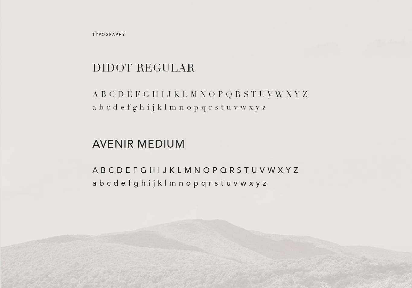
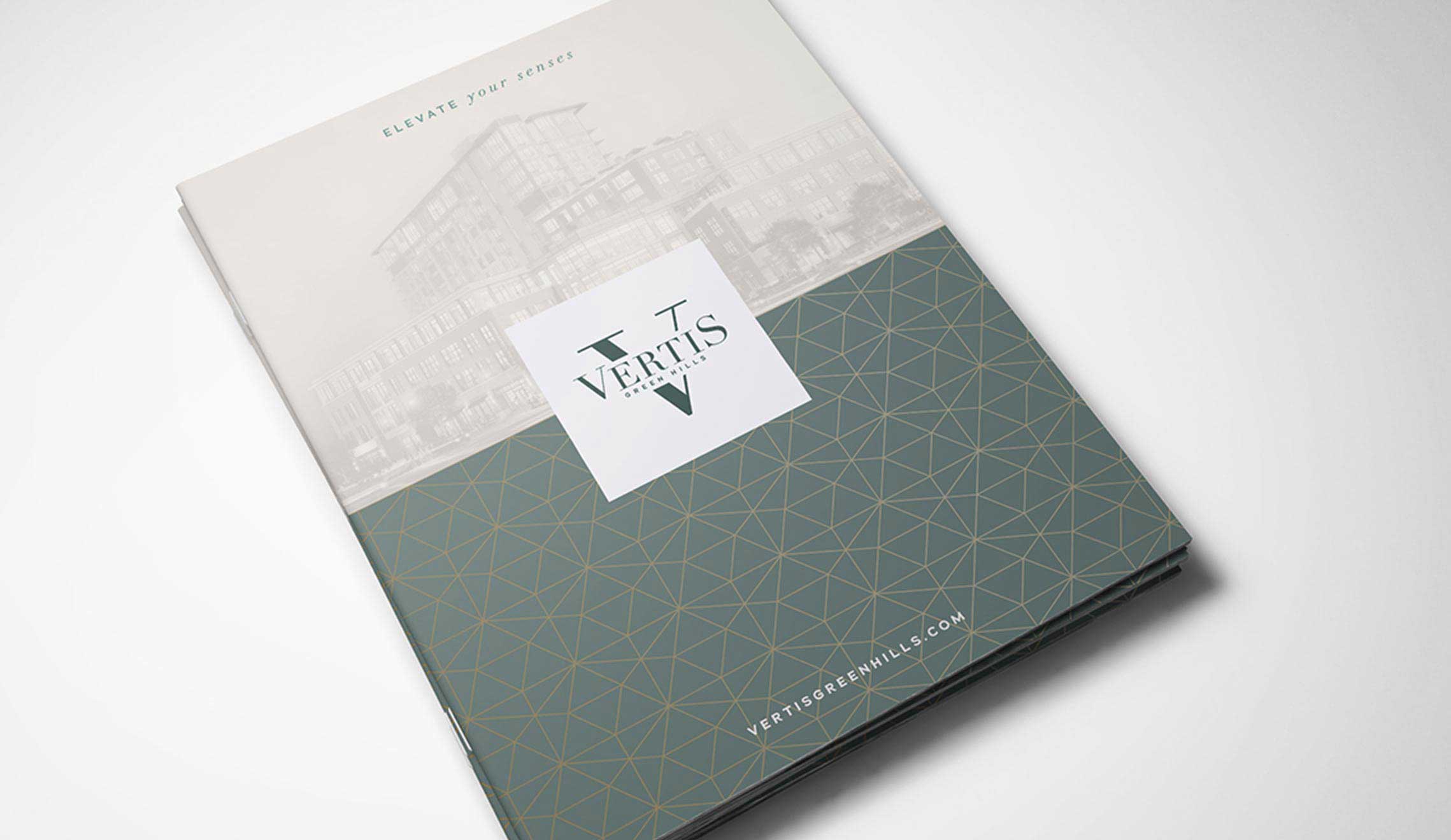
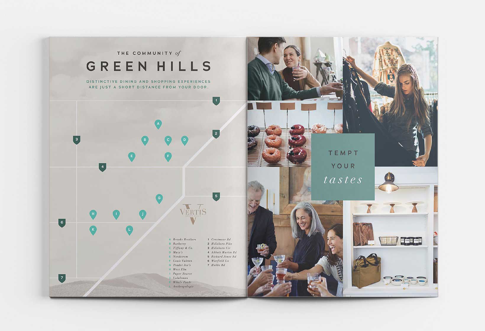
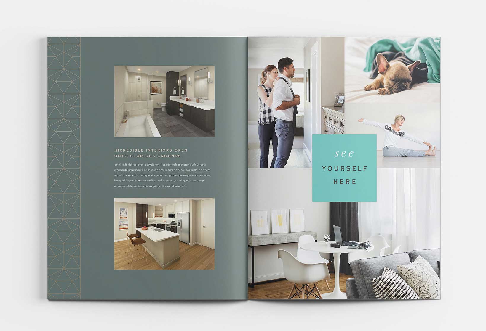
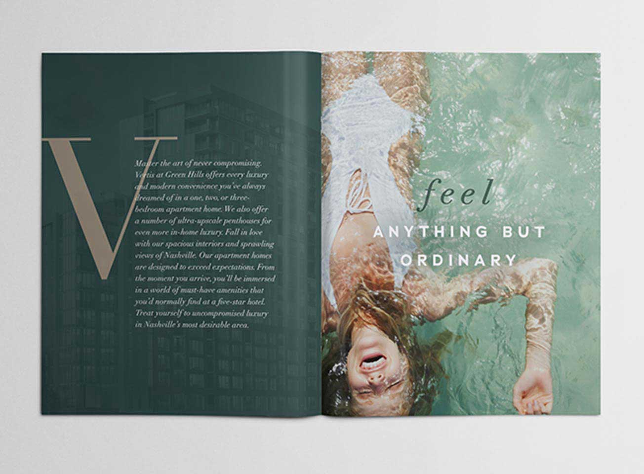
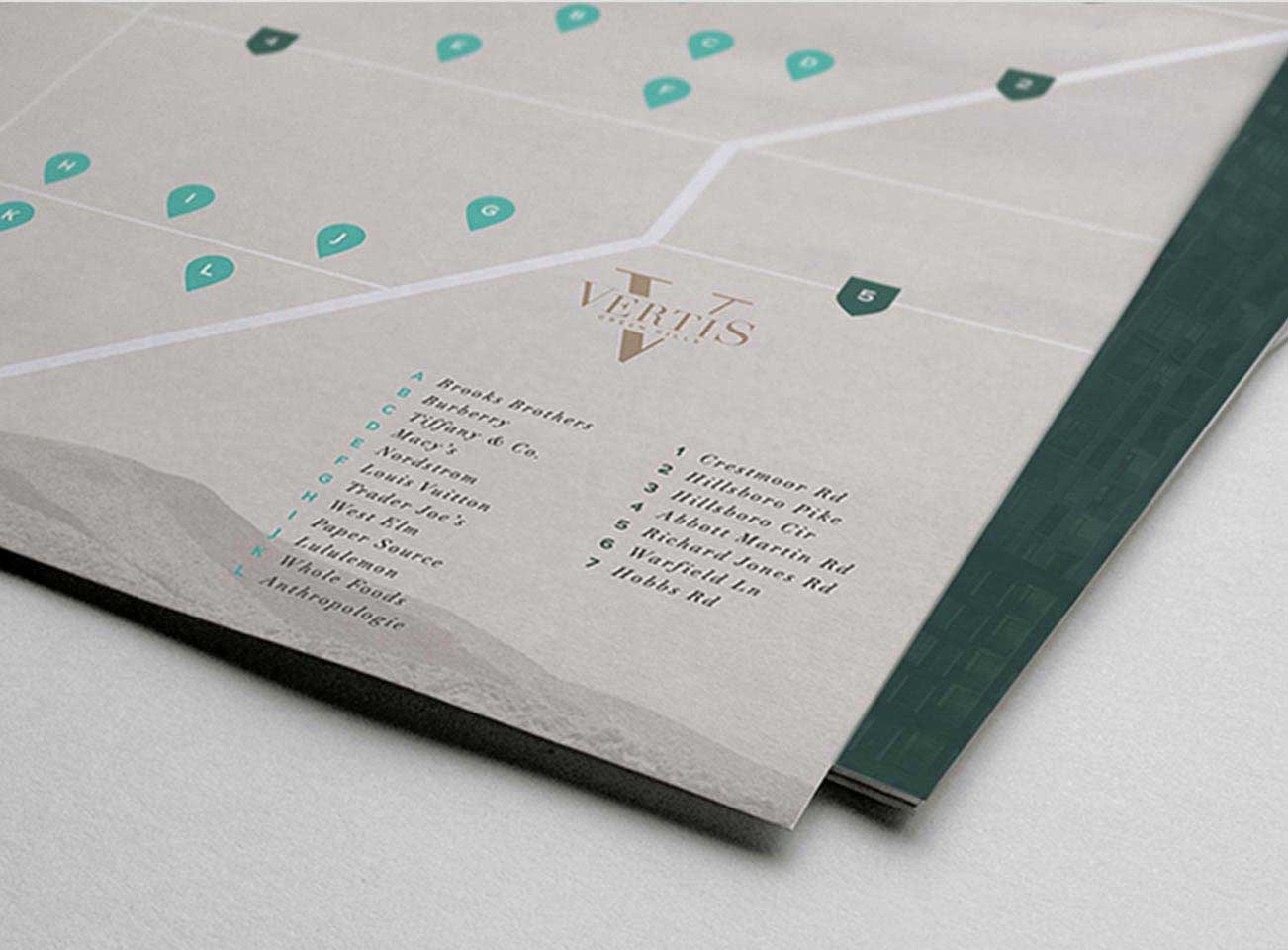
IDEA1’s brochure took on clean and modern style that emulated a coffee table book. We included bold headlines with a box-style type, as well as supporting images that tie back to the property’s core messaging.
“Think Outside, No Box Required” ties back to the property’s communal space, The Hub, used by residents and locals alike for collaboration and events.

Website Features
Vertis’s branded textures and color palette was designed seamlessly into their digital presence. The website includes a full width property rendering video above the fold, a custom-built floor plan browser, and was built on our SPA platform – creating a multi-page, single load website.
Visit Vertis